20 years jewelry packaging manufacturer,
Serving 1000+brands,Passed ISO9001/BV/SGS


You can share
- Share to Facebook
- Share to Google+
- Subscribe to our
- Share to Linkedin
- Share to Twitter
You can share

When consumers are attracted by the physical structure, shape and color of the jewelry packaging box, they usually first see the main information side of the package, that is, the front of the package, and then turn to the right side and back according to the reading habit from left to right. In order to fully understand the product information.
Packaging can generate various elements of attention, which can be divided into basic design elements and secondary design elements. Only by distinguishing the primary and secondary positions of basic design elements and secondary design elements can we better determine the positional distribution of each element on the packaging layout. The size, position, and relationship of each element are determined by the basic layout and basic design principles, and the overall strategy of packaging design usually adopts a system that reflects a sense of hierarchy, that is, visual flow design. A successful information hierarchy design should make the information easy to navigate and follow a visual flow that allows consumers to focus on the important parts first and then the other parts in a logical order.
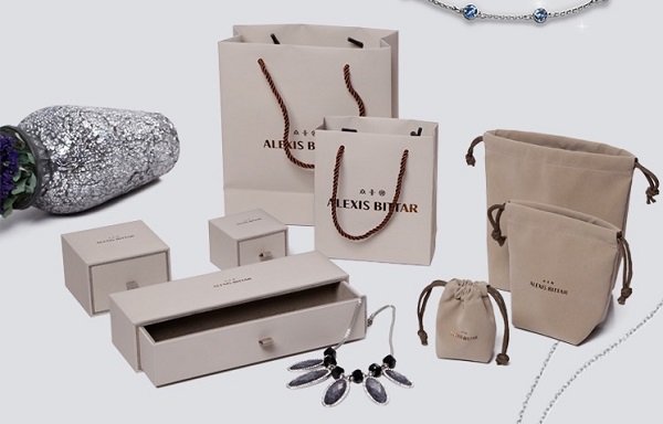
No matter what material the box is made of, there are always one or two pages used to convey important identification information such as trade names and trademarks. This page is called the main information page or the front of the package (PDP for short). The PDP constitutes a display area for key images in a packaging design—communicating the product's market strategy and branding strategy visually. How to increase the sales of this packaging product in the crowded retail environment, PDP plays a key role in it. A well-designed PDP can effectively communicate marketing strategies and brand strategies; it can clearly display product information; it can emphasize information through hierarchical arrangements, which is clear and easy to read and understand; it can reflect the functions and uses of products through pictures; The characteristics of the product are highlighted in the competition of similar products; it can make the product stand out on the shelf, and the color varieties and product differences are easy to distinguish.
In order to achieve a sense of hierarchy and clear communication of information, it is necessary to accurately locate each information element and arrange it effectively according to the rules of visual language design. This is the visual process design. The so-called visual process refers to the movement process of vision in space. When people read information, they have to look at one place at a time, what to look at first, and what to look at later. The line of sight moves in a way of swimming on the layout. This is the visual process. In general, visual process design is divided into three processes: visual capture, process perception, and impression retention.
Visual capture is to mobilize various design elements to capture the attention of consumers within 3 seconds. It can be a commodity, or a scene of commodity use and graphics associated with the commodity, or a brand name or product name. The size of the visual tension leads to a change in the strength of attention. This change is achieved through the rendering of colors and the use of all means such as exaggeration, contrast, repetition, and brightness relationship, as well as various expression techniques, crafts, and materials. The packaging design should enhance artistry to help visual capture, but cannot substitute aesthetics for information communication.
Information communication arranges, organizes, and processes various information carriers in accordance with the laws of visual motion. The level of the content, the characteristics of the form of expression, and the rhythm of the process need to be clarified. The visual requirements of the information carrier are clear and recognizable, easy to recognize, orderly and reasonable, rhythm changes, pleasing to the eye, outstanding personality characteristics, and easy to remember. The most active and dynamic factor in visual process design should be a "sight-inducing medium" that runs through the entire visual process, such as by means of morphological momentum, an extension of visual direction, indication signs, arrangement and direction of explanatory text, etc. The direction of the design moves sequentially, from large to small, from primary to secondary, connecting the various elements of the design in an orderly series.
When consumers observe the product, they usually pay attention to the front of the package first and then return to the front after viewing other information. Such a visual process requires that every informational facet impresses the consumer, especially the main one. Therefore, the trademark, product name, and commodity graphics are generally organically combined to form an "overall trademark" to deepen the impression. In design practice, different types and functions result in different sizes of visual capacity, some of which focus on eye capture, while others focus on information transmission or impression retention, each with its own emphasis.
Commodity information is divided into primary and secondary according to product strategy and brand strategy. Different levels of information, it is arranged on each page of the package, and the level of information displayed on each page is also different. Jewelry packaging box design is to These different levels of information are arranged according to a certain visual process, so as to guide consumers' attention.